The end-to-end design and build of an internal tool to help product teams at Service NSW report on accessibility

While at Service NSW, I worked with the Head of Accessibility to solve a challenge product teams had in sharing their accessibility testing results. Lead by my fantastic PM, I wore both a design and technical hat while helping design, build, and implement a solution for 60+ product teams to use.
Due to government privacy, the visuals shown here are only recreations and the specific tools are omitted
The tool saved product teams valuable hours and effort in manually reporting, as well as the Head of Accessibility over 2 weeks in sifting through the data. More importantly, the tool brought visibility to product accessibility across portfolios and allowed directors and executives to lead from this data.
Outcomes
- 1 hr → 1 minute for product teams to report their results, for 200+ products
- Bottlenecked process, dependent on an individual → work evenly distributed to product teams
- Invisible accessibility → transparent results.
Challenge
Product teams needed to share their accessibility results in a way that is visible to both technical and non-technical folk.
Process
- one week research spike
- mapping user and data journey
- writing user stories and acceptance criteria
- design and development
- 5 user testing sessions
- deployment
Solution
The tool involved three main components:
- an upload screen for users to select their product details and attach their results
- an automated script that
- converted the JSON data into Excel files
- moved filed into a folder structure
- ingested the data into a data visualisation tool
- created interactive and comparative visuals
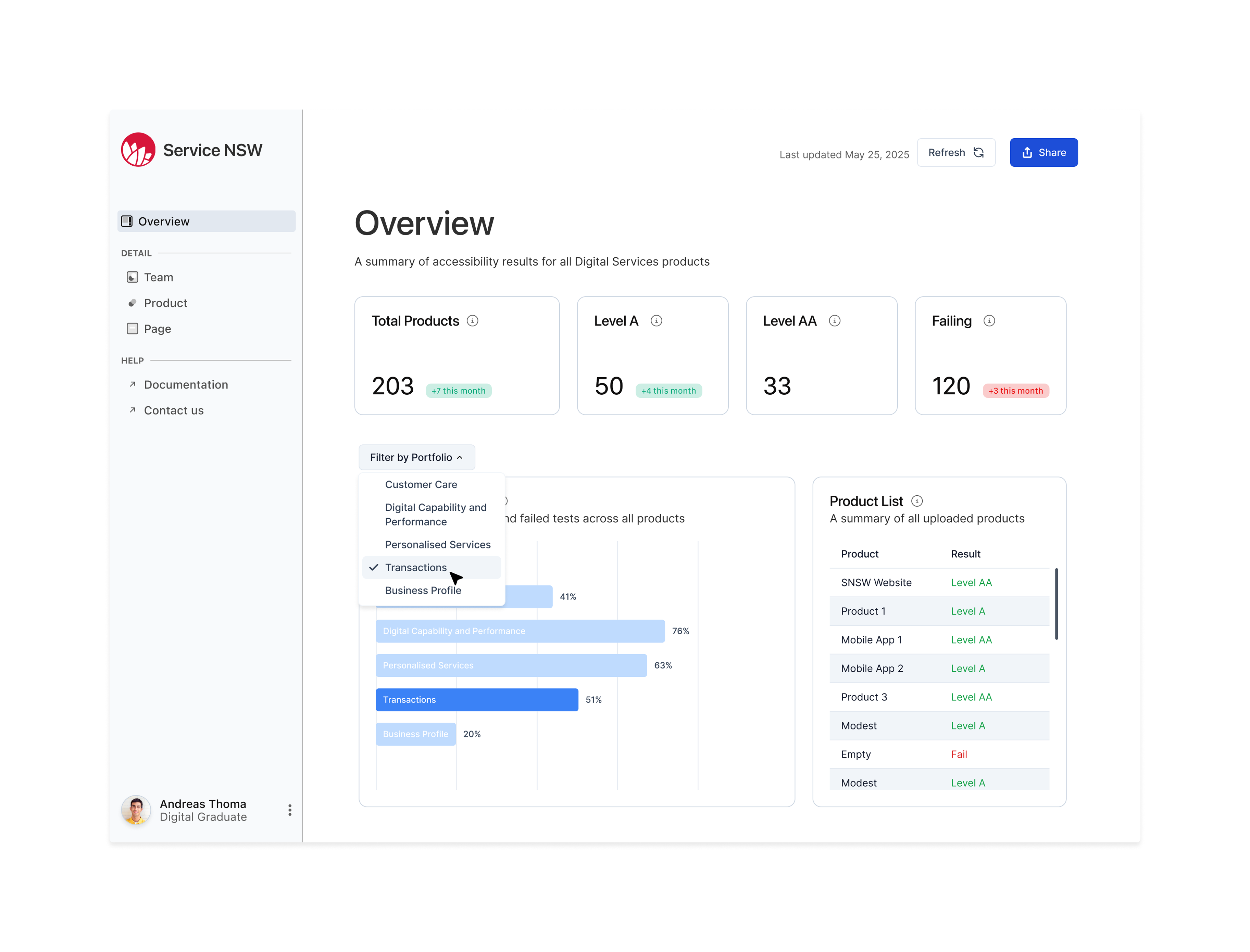
- an interactive visual dashboard that allowed users to filter results by their product, team, or portfolio
Impact
Prior to the this solution, it took product managers around 1 hour of manual effort to complete the process for a single product. It would have also taken “over 2 weeks” in effort from the Head of Accessibility to collate data from all products.
This solution skimmed this down to 1 minute of manual effort per product with a fully automated script to collate and visualise the data.
The tool brought visibility to Service NSW product’s accessibility in a way that hadn’t existed before. Additionally, it saved valuable manual effort and pushed accessibility further into the product development lifecycle.
Being the first time Service NSW had implemented accessibility reporting at this scale, I felt lucky to be able to contribute where I did.
Awards
Nominated for a Department of Customer Service Excellence award
Future iterations
While my rotation has ended, future iterations of the tool could look at:
- integration with team’s planning and backlog tools,
- support for mobile testing tools
- dashboard visualising prior results
To learn more about this project, please reach out.